Dell XPS 13 Review
by Brett Howse on February 19, 2015 9:00 AM EST- Posted in
- Laptops
- Dell
- Ultrabook
- Broadwell-U
- XPS 13
Design and Chassis
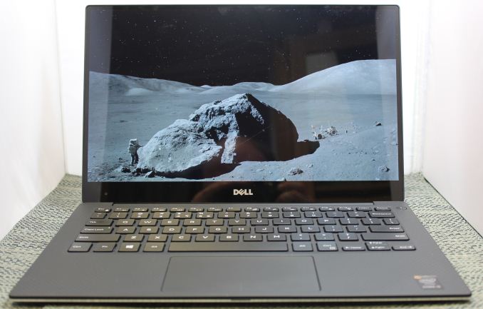
The design of the XPS 13 is the first thing you see, and you would be hard pressed to find anyone who does not think Dell has done a great job with the overall intention. From the external aluminum shell, to the carbon fibre palm rest, to the super thin bezels, the XPS 13 is undeniably a great looking laptop.
Dell has really squeezed the dimensions down for this device. To say that it is a 13 inch laptop in an 11 inch chassis, we should see just how close they got. The Dell XPS 13's dimensions are listed as 11.98 inches (304mm) wide, and 7.88 inches (200mm) deep. Compare this to the MacBook Air 13, which is 12.8 inches (325mm) x 8.94 inches (227mm), and right away it is clear that the Dell is quite a bit smaller. The MacBook Air 11 is much closer in size, at 11.8 inches (300mm) x 7.56 inches (192mm). So truly, the lack of display bezels has changed what we would think of as a 13 inch laptop. If more devices go this route, which they likely will, there will be much more display per unit of laptop going forward.
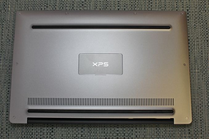
The outer shell of the XPS 13 is completely aluminum, on the top and bottom. This gives the design a premium feel with the very first touch, and compared to the plastic of most notebooks, it is a big step up in terms of materials and finish. While not milled out of a single piece of aluminum, the exterior looks and feels very nicely made. With the notebook closed, there is a black strip around the center, which gives a sharp contrast. Dell paid attention to the bottom of the device as well, with a magnetic plate, hinged on one side, covering the service tag and serial number to keep the bottom looking clean and unblemished.
The left side features the mini DisplayPort output, as well as a USB 3.0 port with PowerShare (you can charge devices while the laptop is powered off) and the headset jack. The speakers are on the sides on the XPS 13, so the left has an unobtrusive speaker grille as well as the battery meter. The right side features another USB 3.0 port, also with PowerShare, as well as the Noble lock and the SD card slot. The second speaker grille adorns the front right of the notebook. The front of the laptop has a single light, which glows when the laptop is charging and flashes yellow when the battery is critical. This makes it easy to tell when the laptop is fully charged and is a nice addition.
The underside of the XPS 13 consists of two full width rubber feet. This makes it plenty sturdy to use on almost any surface and keeps the device stable even on uneven surfaces. The fan intake and exhaust is also under the laptop, which helps keep the noise of the fan at bay. Yes, there is a fan. Broadwell-U promises to be more power efficient, but it is still rated at 15 watts so that heat must be removed.
Once you open the XPS 13, you will be face to face with the wonderful display, which takes up almost the entire width of the device. With bezels only 5.2 mm thin, Dell is marketing this as an Infinity Display, and while it is not quite the same as an Infinity Pool it is still a great effect. Laptop bezels have been quite large for a long time and this new device will hopefully usher in a push to smaller bezels on all laptops.
The XPS 13 does have a larger bezel at the bottom, which serves a couple of purposes. The extra height allows Dell to keep the depth of the laptop larger, which makes more room for the trackpad, and the front facing camera also finds its home in the bottom bezel. This does make it less effective though, and perhaps Dell can find a way to squeeze it back on top without adding too much thickness to the top bezel.
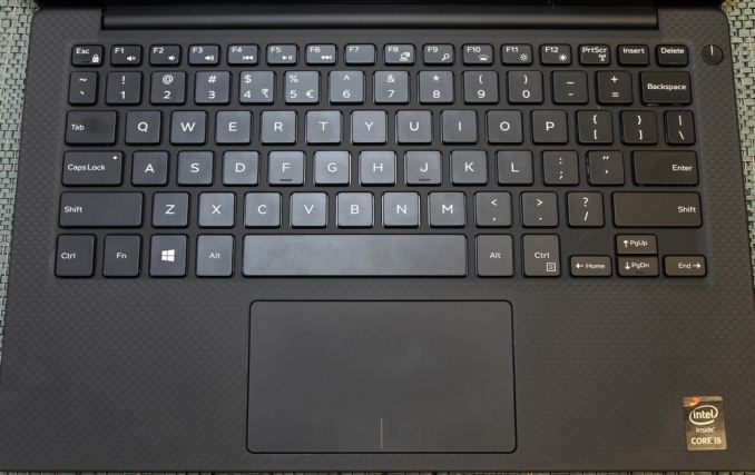
The keyboard is an island style, completely surrounded in carbon fiber. This is then covered with a soft touch paint, which makes it a lot more comfortable to type on than something with an aluminum top and sharp sides. The weave of the carbon fiber still shows through and gives it a great look. The keyboard itself is also quite good for an Ultrabook and the small travel that they entail. The key layout is also fairly standard, and while I prefer dedicated Page Up/Down, Home , and End keys, that would be tough to do on a laptop this small without sacrificing something else. The up/down/left/right keys are well placed and easy to use.
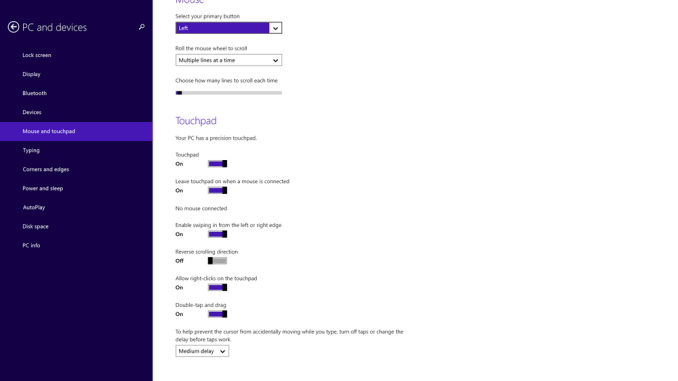
Below the keyboard is the clickpad. Dell has opted to forego the third party drivers and sticks with the Microsoft Precision trackpad model. This moves the settings into Windows and makes them more consistent. There seems to have been no issue with doing this, as the clickpad was responsive and accurate. I do prefer dedicated buttons, but on a device this small that would take away too much trackpad space, so a clickpad is the better choice here.
Overall, Dell has created a great design in the XPS 13. It keeps with some of the Dell traditional designs, but the sharper edges and smaller radius corners contribute to an overall better look. That coupled with the premium feel of the materials, the good keyboard and trackpad, and the very small display bezels, make the XPS 13 one of the more attractive laptops around.


201 Comments
View All Comments
trane - Thursday, February 19, 2015 - link
This must deserve an Editor's Choice award?The only major drawback is the auto-brightness, which I'm sure will be fixed with an update soon. IINM, the original Acer S7 had a similar issue which they fixed with a firmware update. Once that is fixed, I don't think there's any real con! Yes, we would all love it to do Yoga style acrobatics, and have touch for $800, but let's be realistic. Even with the battery life hit the QHD+ option is still class leading! Dell can't fight the the current state of technology...
But the fact that these are brought up as shortcomings just tell us how great this laptop is. I mean, no one's complaining that the $1000 Macbook Air sports an archaic non-touch non-matte low-res TN panel.
Some other sites seem to be reporting much lower battery life versus Macbook Air. I wonder if that is because they are penalising the display for being brighter? Or using Chrome? Chrome has godawful efficiency right now with Hi DPI support, I'm surprised that this is not more commonly known! My laptop does 8 hours with IE, 5 with Chrome.
RT81 - Thursday, February 19, 2015 - link
Believe me, PLENTY of people are complaining about the screen on the current Macbook Air. Nobody cares about touch on a Mac, but they certainly care about the TN and low-res part.repoman27 - Thursday, February 19, 2015 - link
"The FHD model (1920x1080) arrived with a single 4GB memory module and the QHD+ version came with 2x4GB, which gives us the chance to check the performance differences between the single-channel memory and dual-channel memory."These machines are memory down (soldered RAM) configurations. There are no modules, and Lenovo would be insane to not keep both channels populated and simply use different density packages for the different models. Are you sure they're shipping single channel setups?
repoman27 - Thursday, February 19, 2015 - link
D'oh! Dell, not Lenovo.Brett Howse - Thursday, February 19, 2015 - link
Sorry I made a mistake there. It is in fact 2x2GB and the article has been updated.Hulk - Thursday, February 19, 2015 - link
Is it possible that Dell sent the laptops without the ability to change auto brightness on purpose so that the battery life tests would be extraordinarily high? I'm sure they'll be good when the update to turn auto brightness off arrives but most people will remember the hype of the original amazing battery life tests. With all due respect to Anandtech I think they should not have posted battery life tests until they auto brightness can be turned off. It's not really an apples-to-apples (no pun intended) comparison.trane - Thursday, February 19, 2015 - link
To be fair, he did check the brightness from time to time. If there were any notable changes I'm sure they would have withheld the results.Hulk - Thursday, February 19, 2015 - link
You are right and I'm not in ANY way implying there was an bias on Anandtech's part. It's a tough call. Publish the battery life to get the results out there quickly for readers with the caveat of not being able to disable auto brightness or just write "the battery life results look to be very impressive but we are not going to publish them until we can disable auto brightness." I'm just saying I would have gone with the 2nd option for two reasons. First, if with auto brightness off the results are dramatically lower than Dell pulled one over. And second, to send a message to manufacturers that if they don't allow fair comparisons due to locked software not all testing results will be published.As I wrote above it's a tough call and I respect Anandtech's decision I just disagree with it.
andrewaggb - Thursday, February 19, 2015 - link
The battery results are fantastic, I wonder how much the auto-brightness plays into it. I wonder if you pointed a bright light at the light sensor if that would force the brightness to stay at maximum.JarredWalton - Thursday, February 19, 2015 - link
FWIW, I've run tests with laptops at 100 nits before just to see how much that would help. The difference between 100 and 200 nits is usually on the order of 30-60 minutes at most, and often less. However, to get 15 hours from a 42Wh battery means that the laptop is using around 2.74W in our Light workload. If the display adaptive brightness saves 1W, battery life would drop to 11.24 hours (give or take). Which is what happens with the QHD+ panel I should note, though how much of that is the display alone and how much is caused by a higher load on RAM and CPU/GPU to handle the higher resolution is difficult to say.